Docquity
Docquity is an app for doctors, medical specialists and med students to exchange ideas with the best of them in the South-East Asian region. It also is a platform to receive educational resources designed by well-known and respected leaders. Additionally, it provides a space to attend virtual discussions with world-class speakers.
Industry: Healthtech
Role: UX Designer, Co-researcher
Tools: Figma, Miro
Duration: 11+ Months
Way forward
The Docquity user-facing App and Website needed a make-over and an exhaustive plan from research to design. The platform had been running for a while and thus had generated a lot of data and user insights.
It was important to take into account all of it while rebuilding from scratch and attending to some key pain points.
-
The size of the project demanded an alignment with the stakeholders and a huge download of information before jumping into the research phase.
In this discovery phase, we looked at stakeholder interviews and detailed design audit.
-
We conducted in-depth qualitative research comprising user interviews, detailed usability tests and a thorough competitors analysis.
-
The design phase was broken into 2 modules, App and website.
User flows, wireframes and working together with the UI team were executed in a seamless fashion over 6 8 months.
Discover
We began with stakeholder interviews and a Q&A session to gain a deeper understanding of the ask.
Following this, we conducted a comprehensive Design Audit, which helped us closely examine the app to identify any gaps in design or overall user experience.
For a more detailed version of the Design Audit, please refer to the link below.


Research
Stats accumulated over 150 Days observing 130,000 participants
Some key insights
Armed with the knowledge gathered from the stakeholder interview and design audit, we conducted user interviews and usability testing during the research phase.
80% of users drop off during onboarding
24% of users drop off at language selection
The search tab only saw 2% exploration
Only 3% explore the feed
The input phone number screen saw a 14% drop-off
The conversion rate was less than 20%
Competitor analysis
A detailed stakeholder analysis gave us great insight into understanding what works and what doesn’t and also highlights the trends that are more relatable to the users.


Qualitative Research


Personas
After the user interviews, we analysed the data and filtered out 3 major personas that were used as references while designing the app and website.


Usability Testing Conclusions

During the usability testing, the participants were walking us through the screens and we mapped their activities to help them with relevant prompts to talk about their emotions and experiences.

App Wireframes
The high-fidelity wireframes were designed using the original app as a reference for the user flows and architecture. The wireframes are designed with proper fonts, illustrations and minimum colour to enable the stakeholders to view the visual hierarchy on complex screens.
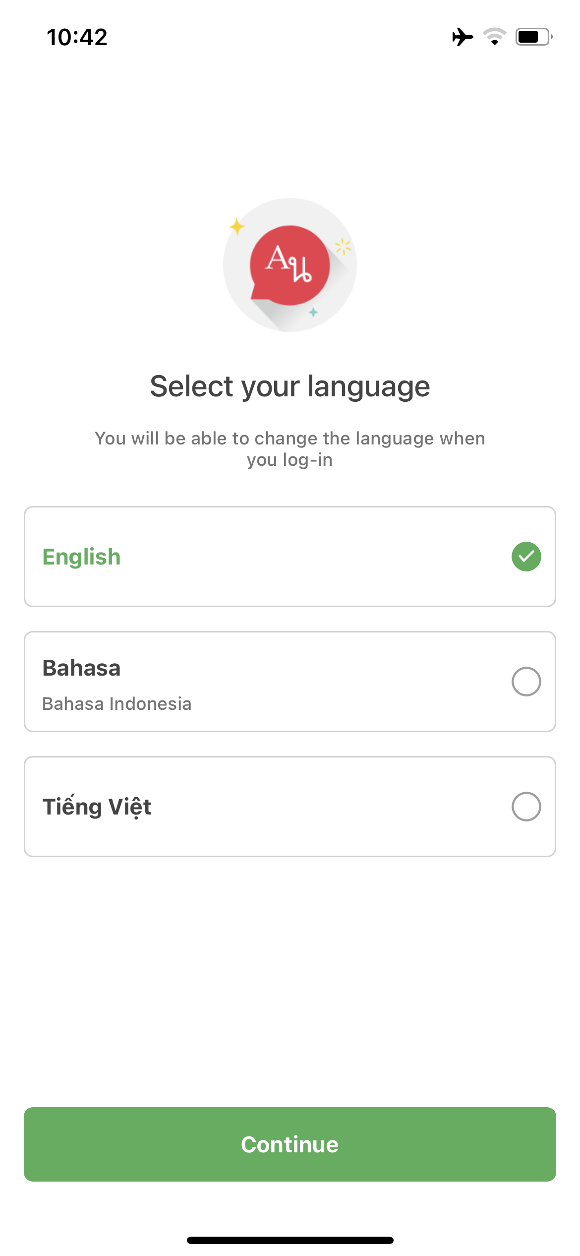
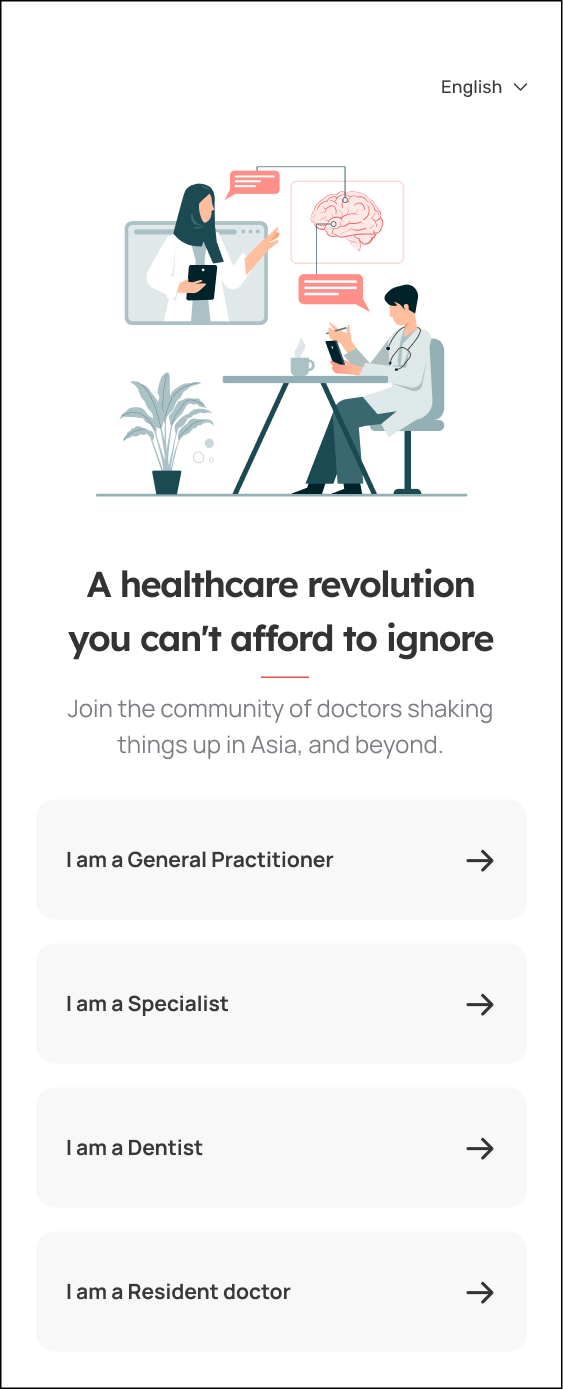
Onboarding
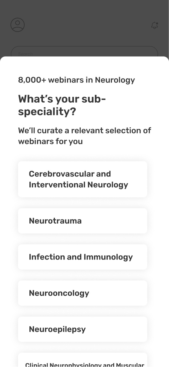
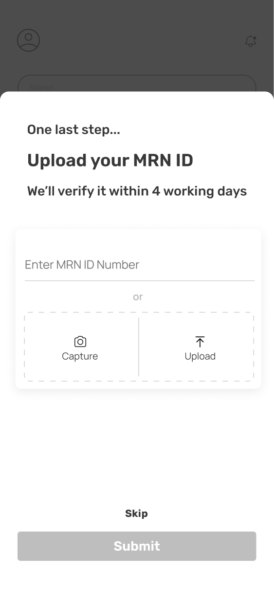
The insights from the data drawn and the user interviews were that most users were not able to seamlessly complete the onboarding.
In the new screens, I attempted to create a wizard approach for guided onboarding.
The verification screen has a skip option which opens up a limited-view homepage.
-
![]()
Screen 1 - After Logo Flash Screen
-
![]()
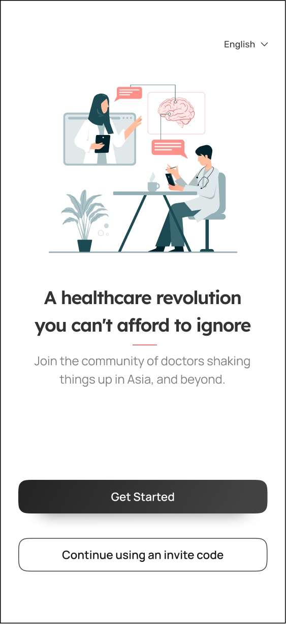
Screen 2 - get started
-
![]()
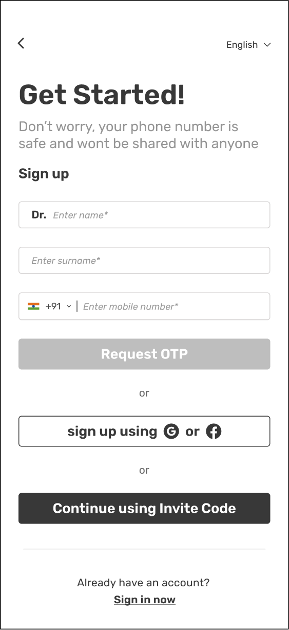
Screen 3 - Sign up
-
![]()
Screen 4 - Post login
-
![]()
Screen 5 - Selecting speciality
-
![]()
Screen 6 - sub speciality
-
![]()
Screen 7 - Verification

Profile
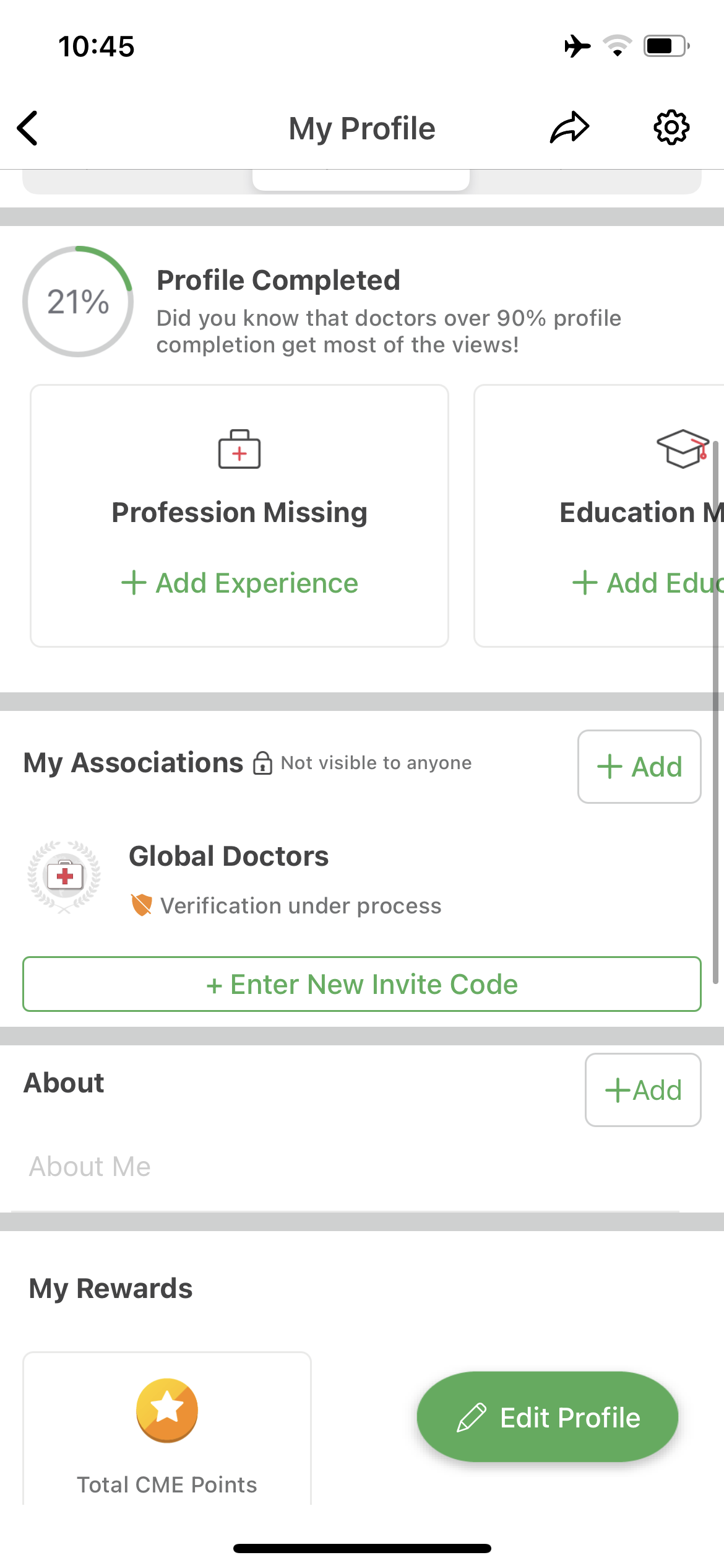
Profile
The new user and regular user profiles were drastically different and unappealing.
In the new screens, there is something for everyone creating intrigue to build further.
There is also a profile for the user who hasn’t completed verification. This creates a sense of FOMO and thus evokes urgency to be at par with the other users.
Edit

Share


Profile - show more

Activity

Search
Search on tap
The search functionality was another important feature, especially for the senior or less tech-savvy doctors.
Thus it was important to make the most of one tap for the search screen.
I wanted to place focus on increased accessibility to multiple touchpoints from the search bar.
Search results


Clinical Cases
Closed Case

The annotate feature was the most appreciated among doctors and professionals.
They were able to give detailed explanations by marking the images and blurring out a patient's identity for privacy.

The most challenging, engaging and core feature of the app was the create clinical cases.
The data and interviews repeatedly highlighted that users were not able to generate their own content due to poor guidance and visibility of the feature. This was one of the major reasons for the value drop.
I successfully re-designed the entire post a clinical case journey with a step-wise guided input format to take into account that doctors generally don’t have the time to learn new ways in the tech world.
Open Case


Annotate

Blur
Final App Screens
Closed Case - input


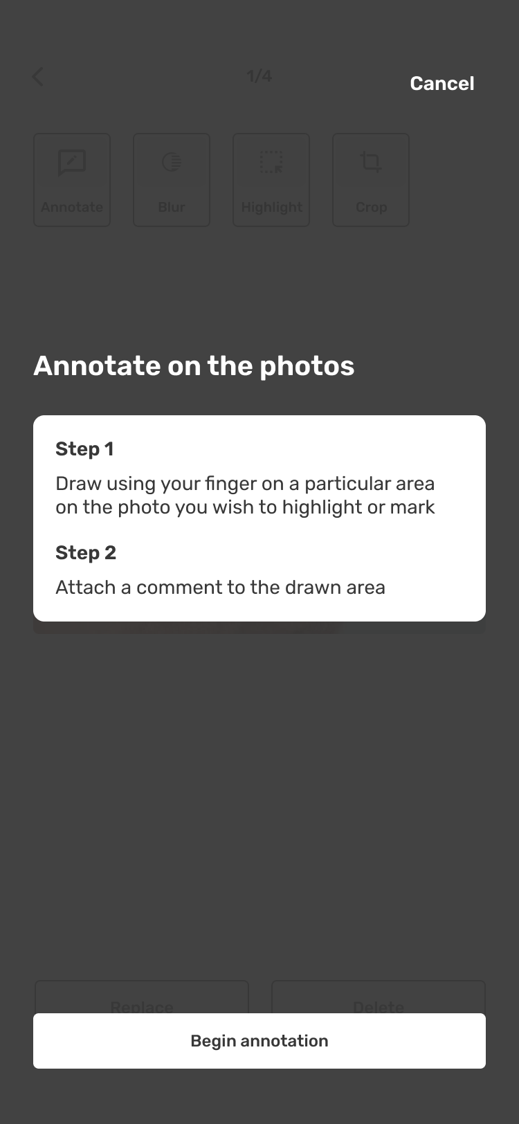
Annotate

Blur


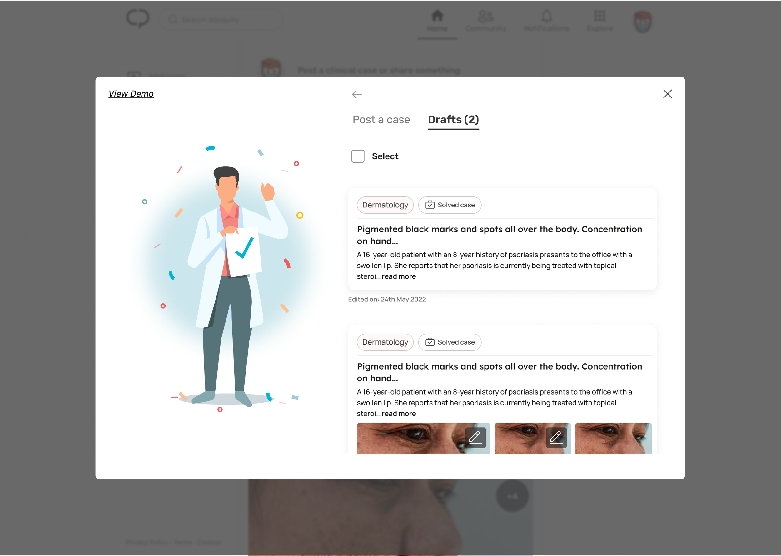
Drafts


Annotate

Blur
Largely, the re-designed app was used as a reference point for the website. However, the liberty of real estate and certain features that the doctors preferred to use on a laptop screen were tweaked for better comfort.
Web-app Wireframes
Homepage

Doctalks (webinars)
Doctalks - homepage
Webinars or Doctalks were another high-value segments on the web and the app. Many doctors and students would attend webinars and in most cases that would act as the prime module of this platform.
Doctalks - search

Doctalks - For you


The search function of Doc Talks is only applicable for searching within the platform. It is separate from the top search bar, which is designed for global searches within the web application.
Doctalks - search

The browse section displays categories with a view all button. Highly rated webinars is another helpful suggestion to stay up-to-date with the content that is highly rated and viewed.
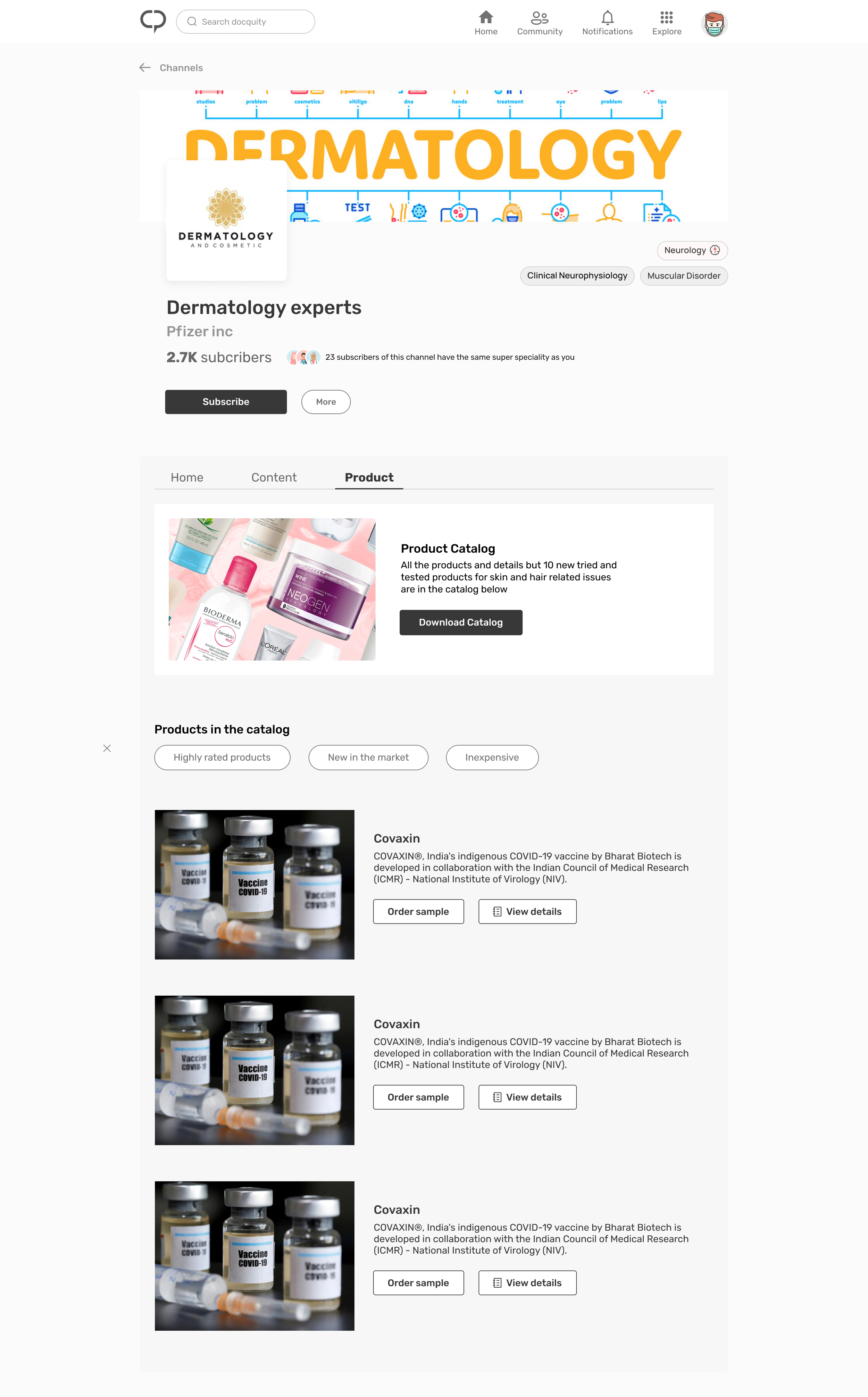
Channels
Channels are a good space for companies to market their products and also provide a great source of revenue for the platform. Doctors are able to view and explore new products in the market too.


Search

The search module was similar to the one on the app however, the web app offers more real estate to use for easy navigation and accessibility.
The ability to create a post is a highly significant feature. Although the flow remains consistent with the app, the web app provides more space for a guided flow and improved visual hierarchy, resulting in a better user experience for all types of users.

Create a Post

The available choices are similar to those found on the application. However, favourable comments and data from past posts serve as a source of inspiration for the user, thereby motivating them to create more content.
Through user data and interviews, we learnt that the discoverability of the depth of the app was a major problem.
In the refined designs, we brought all the touch points upfront. The main navigation is on the top and left of the page. The trending section aids in discovering new topics and cases


Although the process of posting a case remains unchanged, the web version has been redesigned with new visuals and hierarchy to enhance user attention. Moreover, a "view demo" feature has been included for beginners and those who are not tech-savvy.
-
![]()
Post a case
-
![]()
The input fields are highlighted to mute out the background distractions. This helps the users to fill out each section without missing any.
-
![]()
Annotate - highlight
-
![]()
Annotate - highlight
-
![]()
Annotate - blur
-
![]()
Annotate - video
-
![]()
Emergency case pop up description
-
![]()
Drafts with last edited highlights
-
![]()
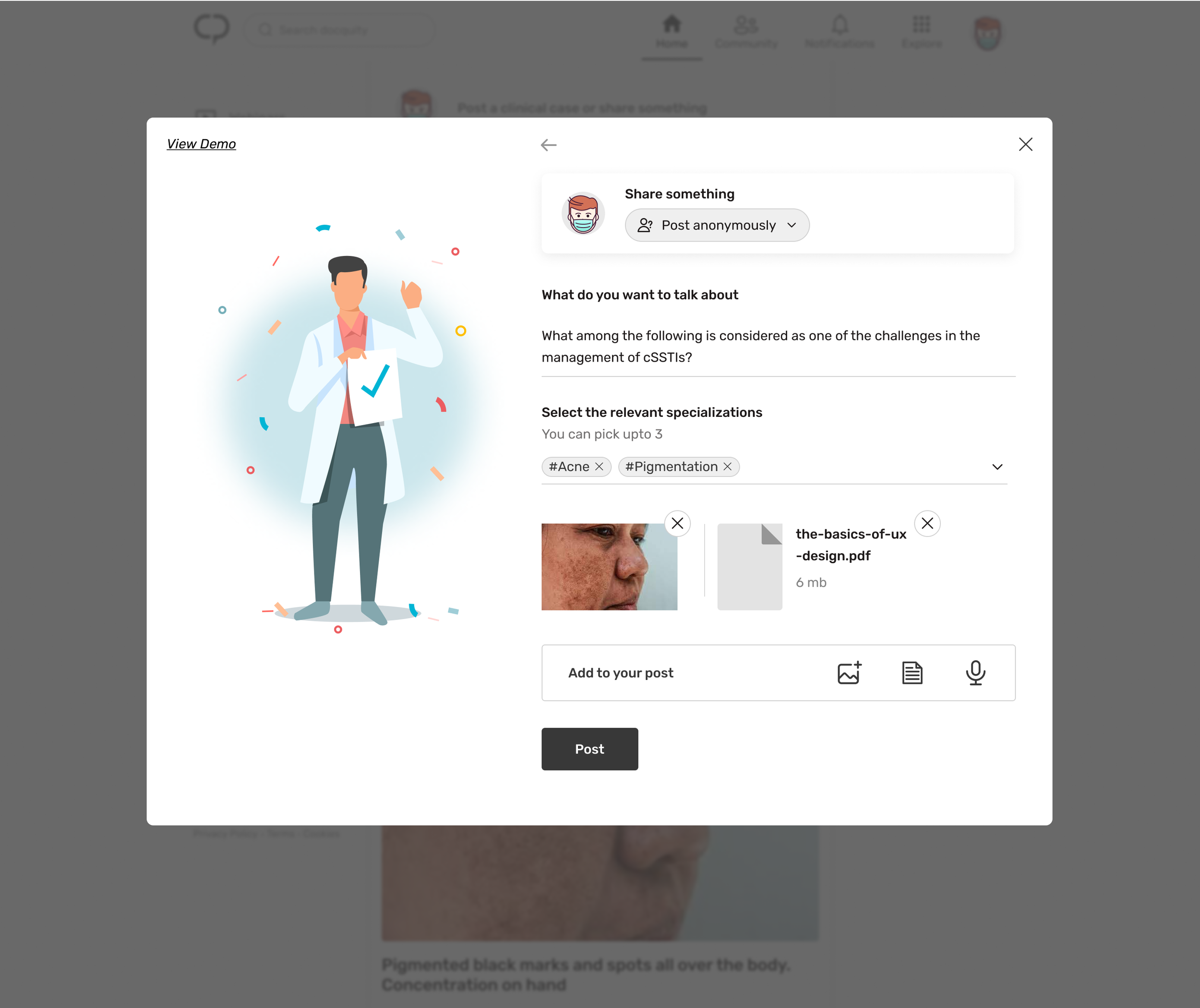
Share something
-
![]()
Share something - filled state with images and documents attached
-
![]()
Share something - create a poll
-
![]()
create a poll - homepage view